Lulu dans ma rue · Service design · Social inclusion · 0→1
Designing for access, not preference
Turning one paper-based kiosk in Le Marais into a service supporting 250–300 requests a day, across four digital and physical touchpoints.
- Role
- Founding Designer
- Team
- Founder, small in-house team and external collaborators
- Timeline
- 2016 – 2017
As the only designer, I owned the full service design across four surfaces (customer app, provider app, back office and physical kiosks), working directly with the Lulus, the local providers who delivered the services, and bringing in external partners for illustration and web.
Context
Lulu dans ma rue is a city-backed platform that connects Paris neighbors with local service providers, the Lulus, for everyday help: cleaning, small repairs, errands, tech help. It started as a proof of concept with a social inclusion mission: showing that a business could sustain itself, serve its customers well, and be good for society at the same time.
Customers came for different reasons: some were drawn to the project's philosophy, others simply found it useful and practical. The Lulus came from two very different populations: young, tech-comfortable people looking for flexibility, and people at risk of exclusion looking for stable income, often with little digital experience and limited French.
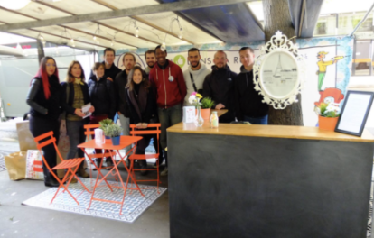
When I joined, there was one kiosk in Le Marais, running on paper.
How I worked
Researching with people who blame themselves
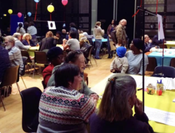
Sessions looked very different depending on who was in the room. Tech-help Lulus came with complaints and ideas for improvement. Many cleaning Lulus, often very grateful to be there, assumed that if something didn't work, it was their fault. They struggled with the app, but would never say the app was the problem.
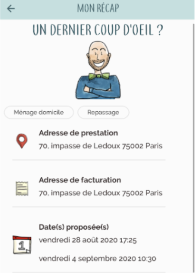
That's why research had to happen through observation, group sessions and prototype testing, not just by asking. And it shaped the interaction model: a universal design built on color codes and a radically simplified experience, usable by someone with very limited digital experience. For experienced users, we added shortcuts to get things done faster, without making the app harder for everyone else.
Findings
What the fieldwork showed
Before touching any tool, I spent weeks embedded at the kiosk in Le Marais, watching how the service actually worked on the ground.
Requests arrived incomplete. Communication didn't break down; information was missing. A concierge would pass on a request, say a repair in someone's kitchen, but the Lulu couldn't tell whether they could take it. The back-and-forth cost time and frustrated customers.
Trust was built by people. In the kiosk, the concierges reassured neighbors and explained how it worked. That was what made someone comfortable letting a stranger into their home, and the hardest thing to carry into a digital product.
Lulus cared about fairness, not speed. We expected providers to compete, grabbing missions as fast as possible on their phones. Instead, they cared that work was shared out fairly.
Key decisions
Requests a Lulu can say yes to
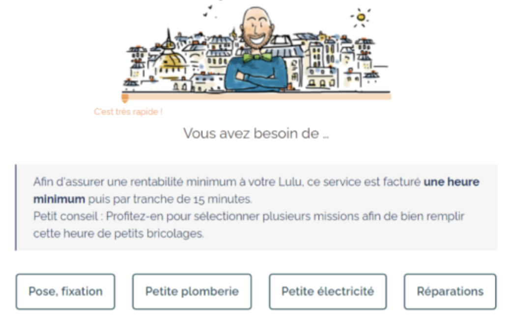
We mapped every type of service and the information each one needed. In the apps, each request launched a guided flow of questions, sometimes very specific to the job, so the Lulu had reliable information to decide whether to accept. A phone call was always possible to settle details: we couldn't capture everything, but we made sure nobody accepted blind.
Carry human trust into the digital product
In the kiosk, trust came from the concierges. In the app, we made reaching a person easy at every step, and made the support behind every Lulu visible: each one was accompanied, followed up, and problems could be reported.
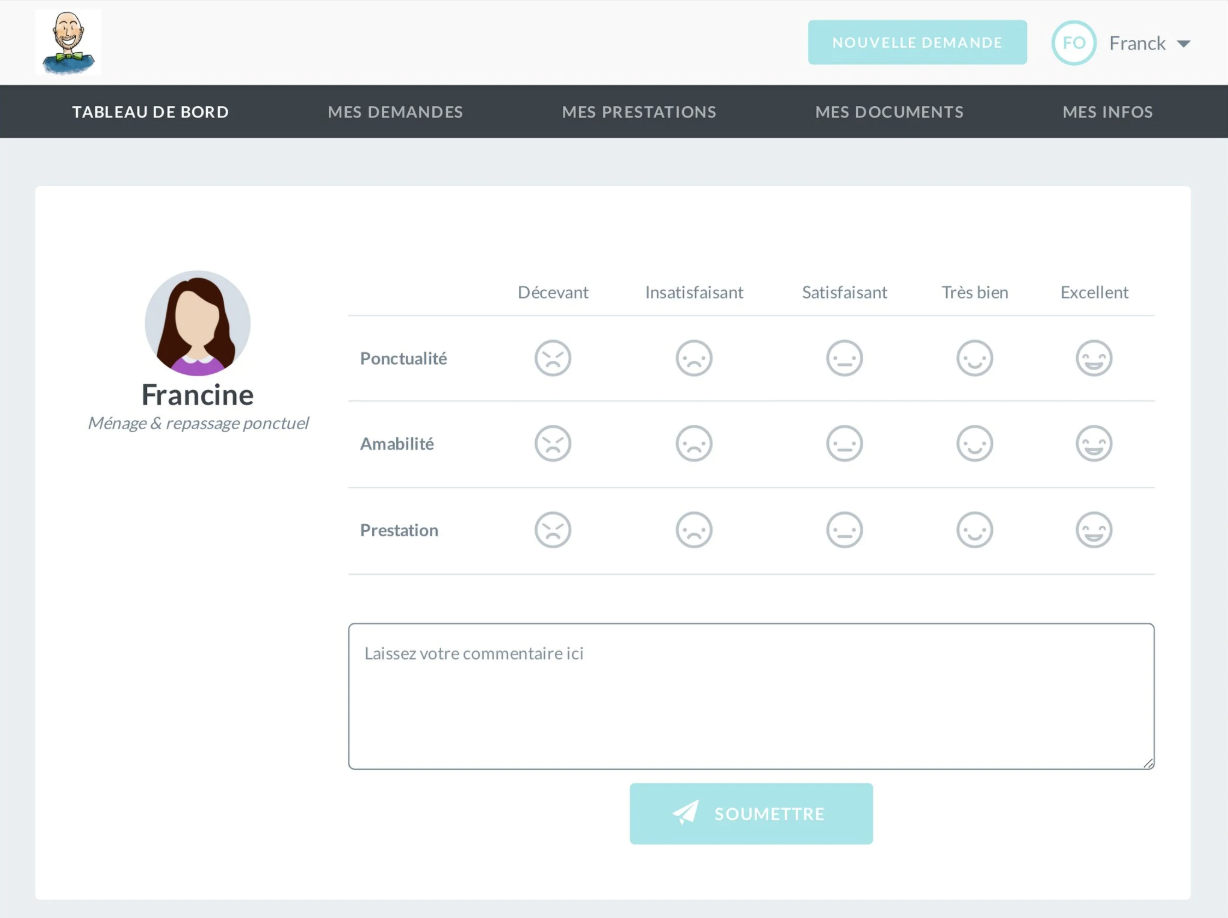
Customers rated every service, and concierges rated reliability. We also invited customers, in the app and in person, to share feedback, framed around the project's social mission, closing the loop between what Lulus did and how they were seen.
Fair over fast
The hardest balance. Customers wanted missions accepted quickly; Lulus wanted work shared fairly. The assignment algorithm balanced both: missions were offered with a delay to Lulus who had already done many, without slowing acceptance down too much. Later, Lulus could optionally share their availability. We couldn't require it legally, but it let us match workload to their schedules.
Kiosks as trust infrastructure, not a fallback
The app didn't replace the kiosk. The kiosk was the primary place for onboarding and for the social connection, and the trust it created. Human support was designed in as a core part of the service, not as a fallback for edge cases.
Impact
What design moved
daily service requests supported, in 18 months
Driven by: Guided requests that Lulus could accept without back-and-forth (decision 1). The new kiosks and more Lulus (below) also drove this growth.
Lulu complaints about missing missions or not understanding how to accept them
Driven by: Fair assignment (decision 3), and the simplified, color-coded provider app (how I worked).
Where the service went
- Active Lulus
- ~60 → 250+
- Physical presence
- 1 paper-based kiosk → 3 kiosks, a van serving markets, and a stand in a shopping center
What I'd do differently
I'd focus purely on observed frictions rather than assumptions about who the users were. Designing for accessibility means removing the barriers people actually encounter, not the ones you predict based on their background.
Get in touch if you want to go deeper.